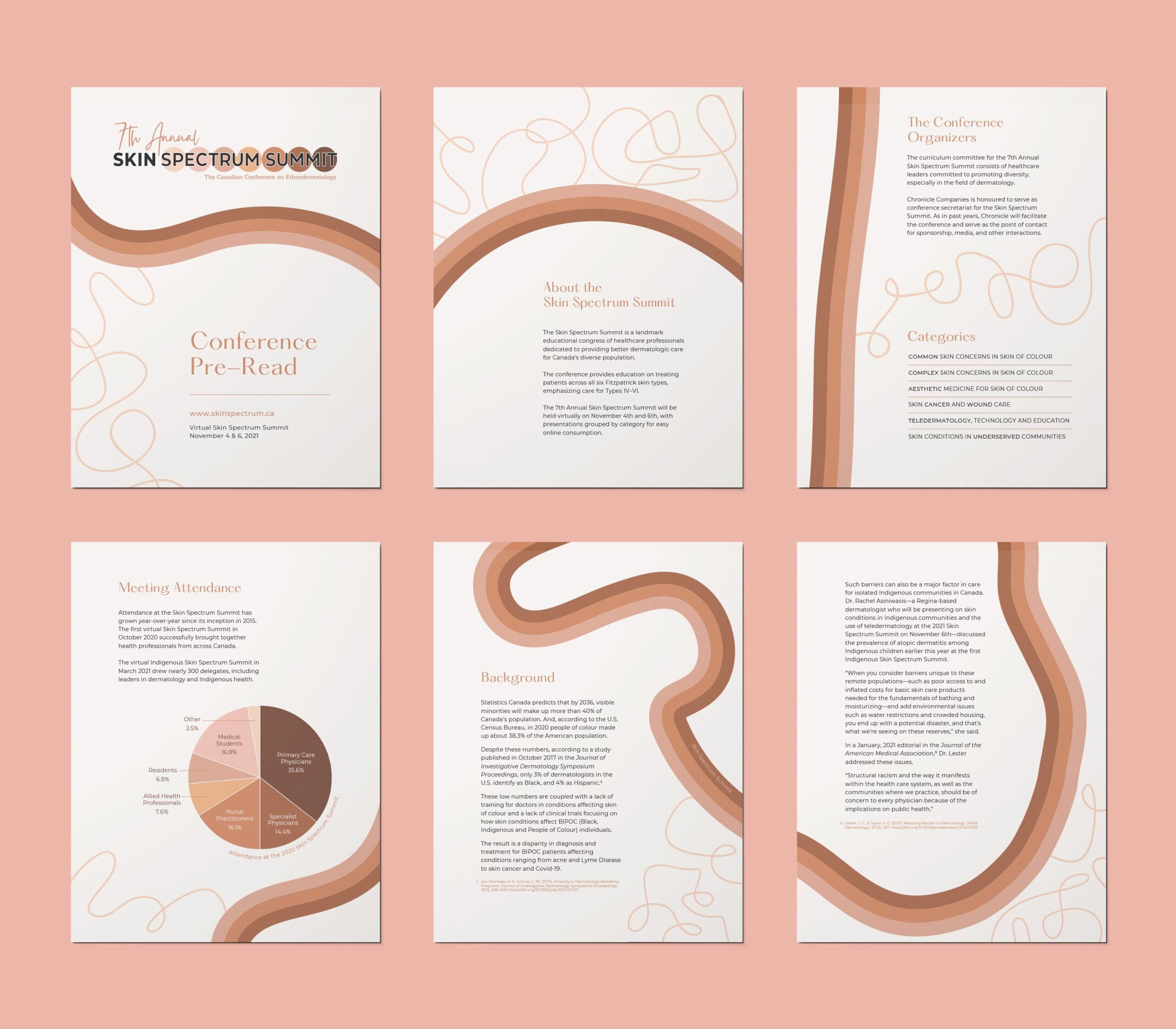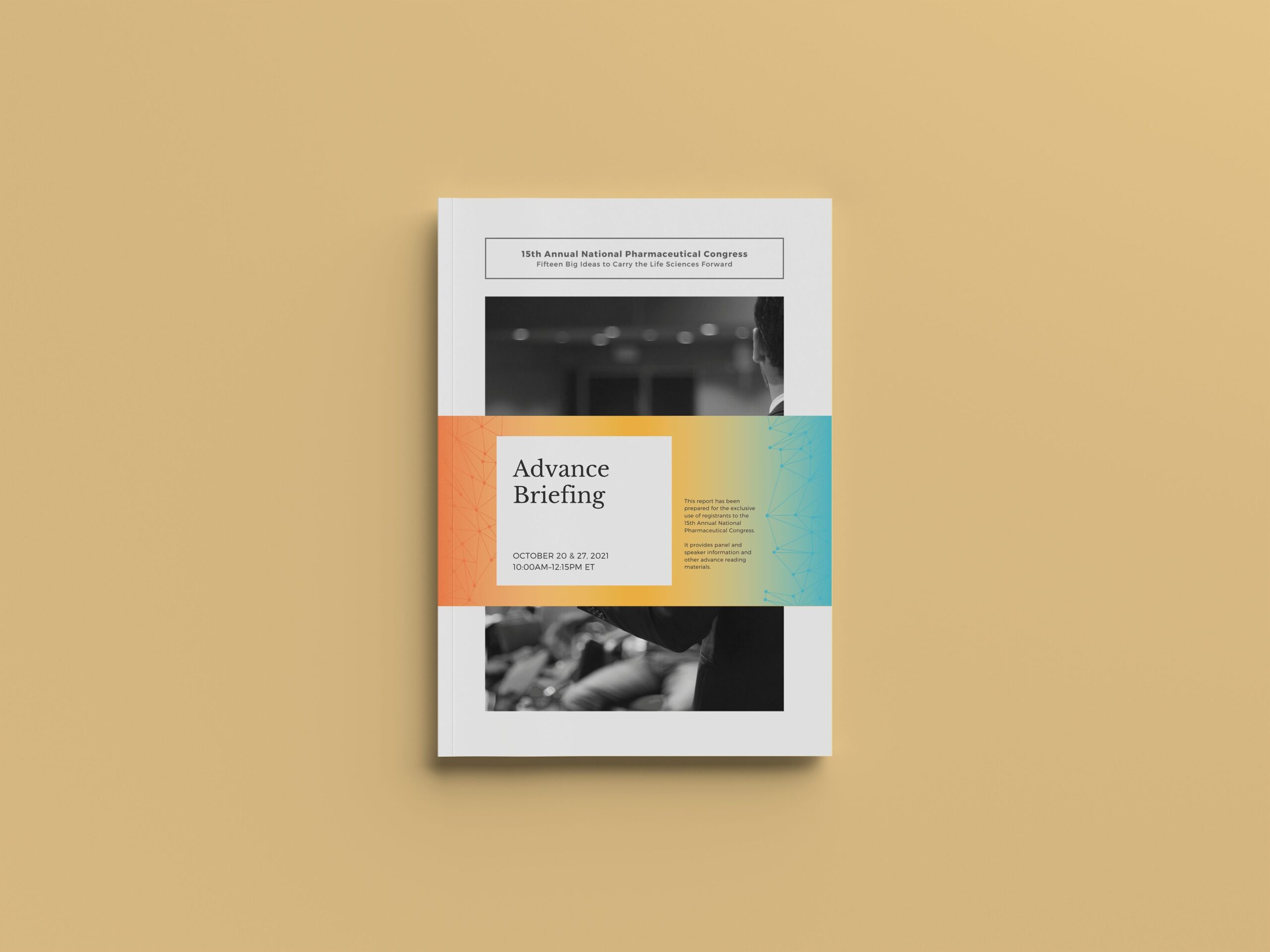
An educational conference series for early‑in‑practice dermatologists.
About the Client
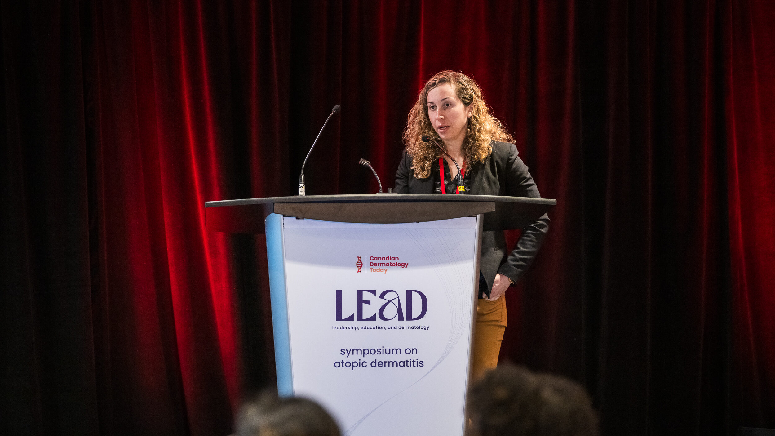
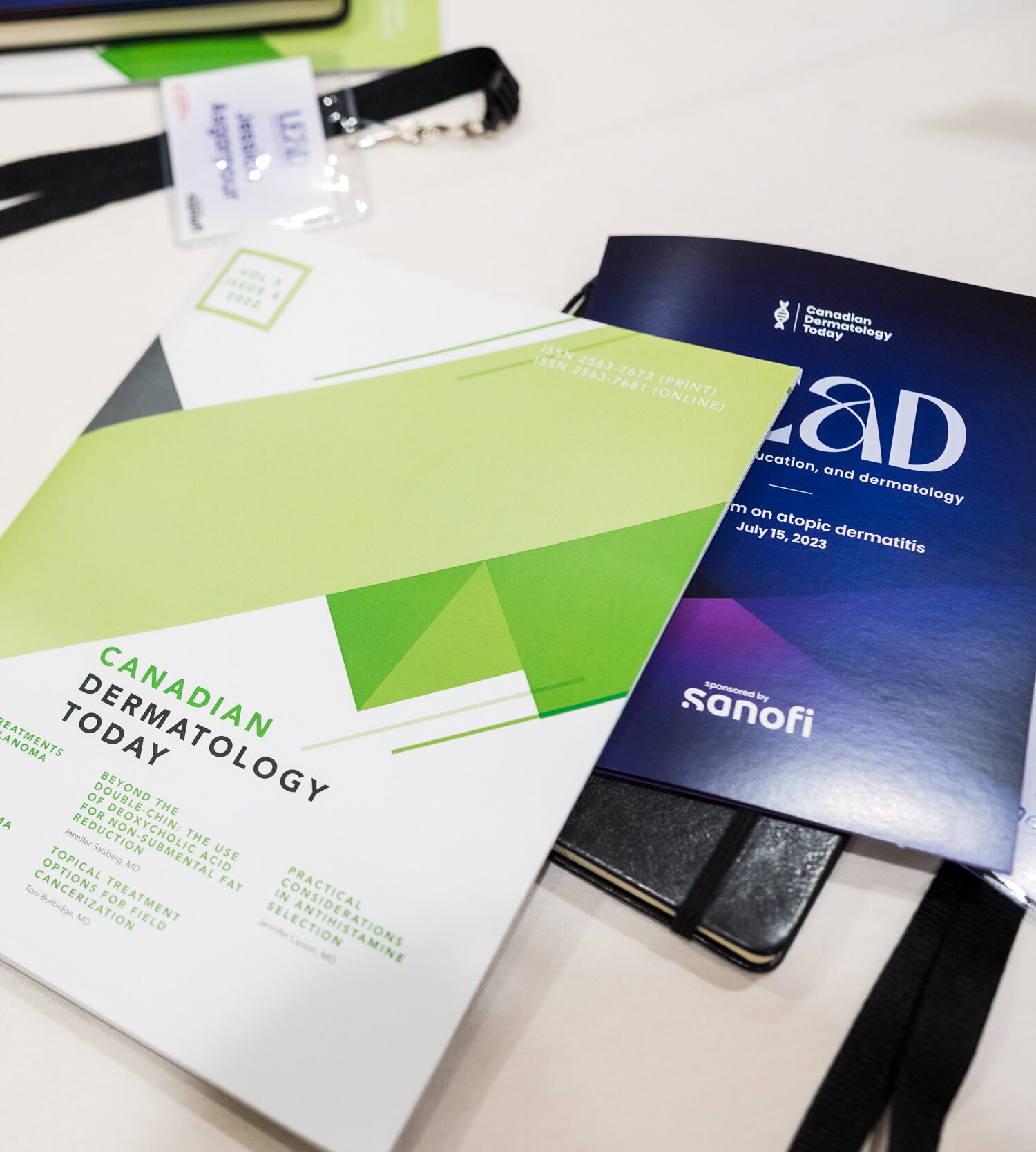
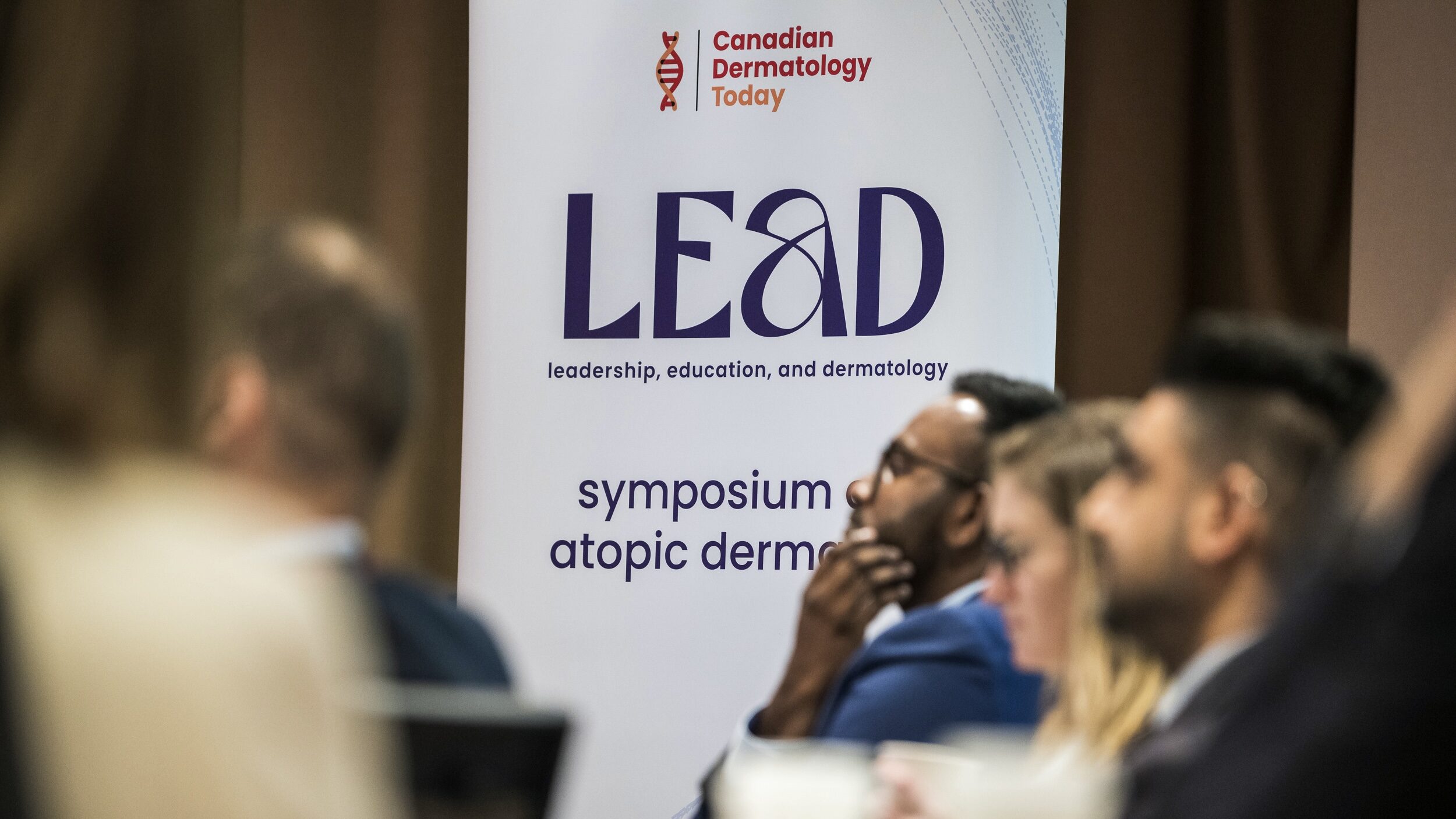
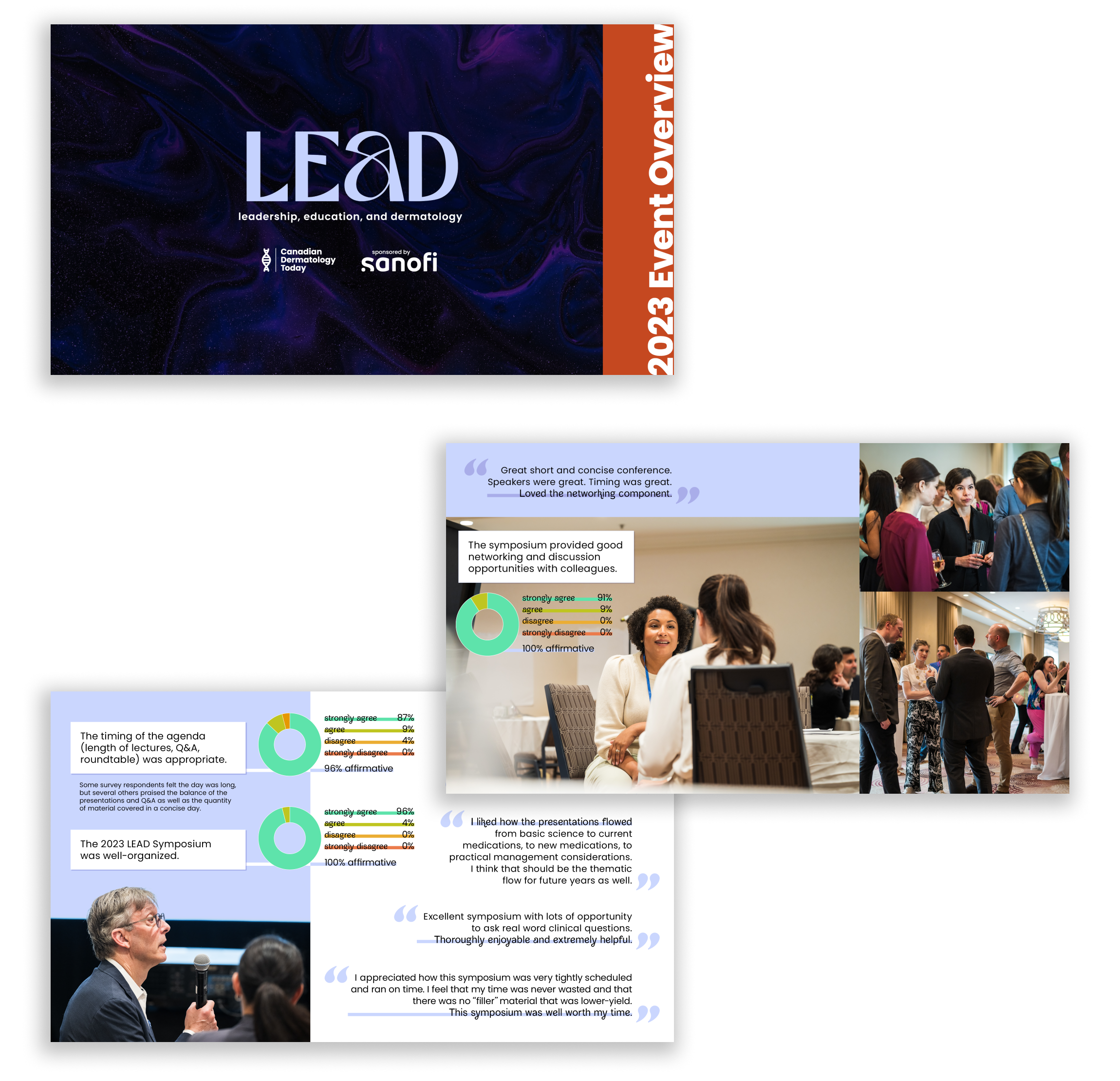
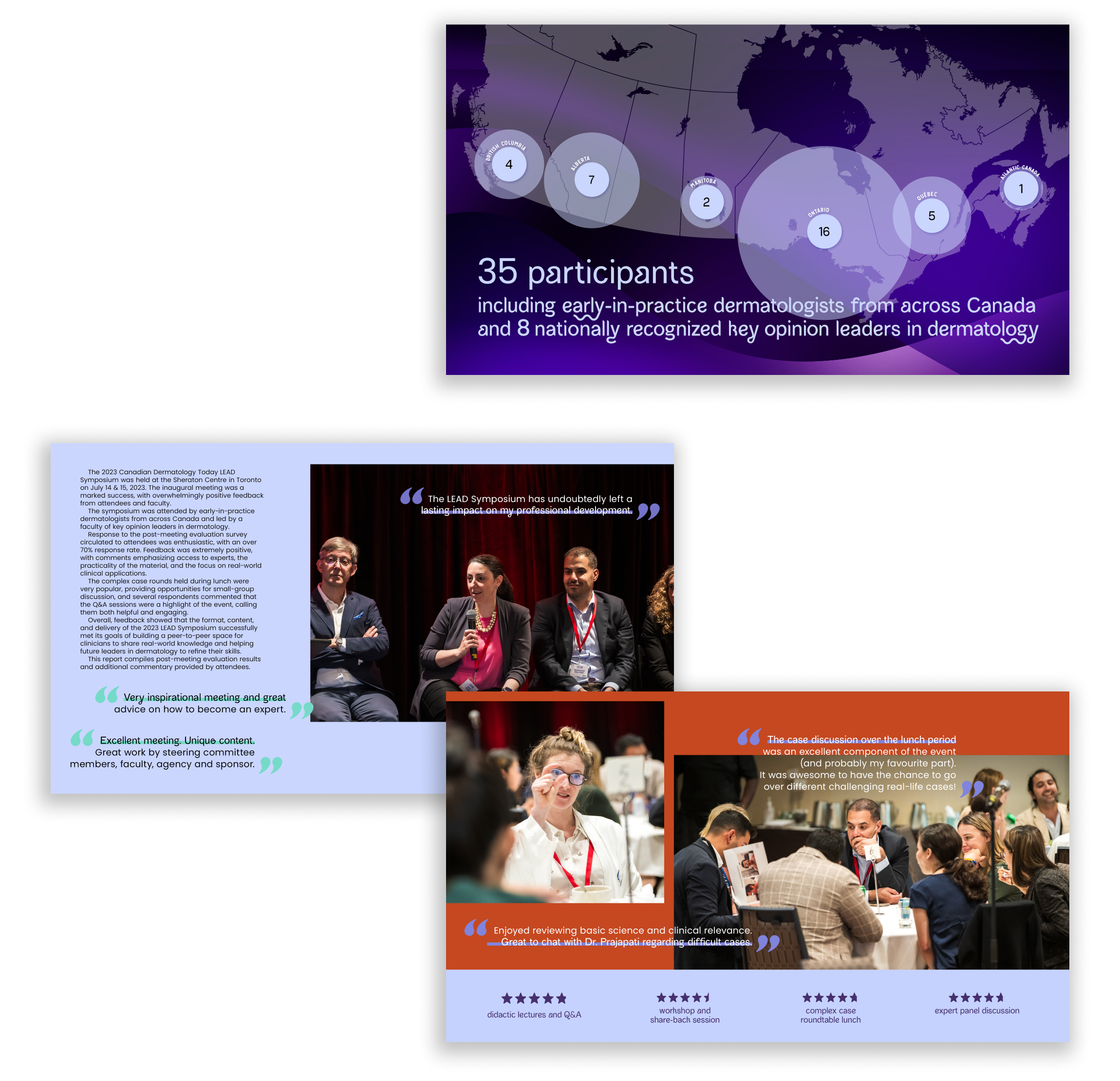
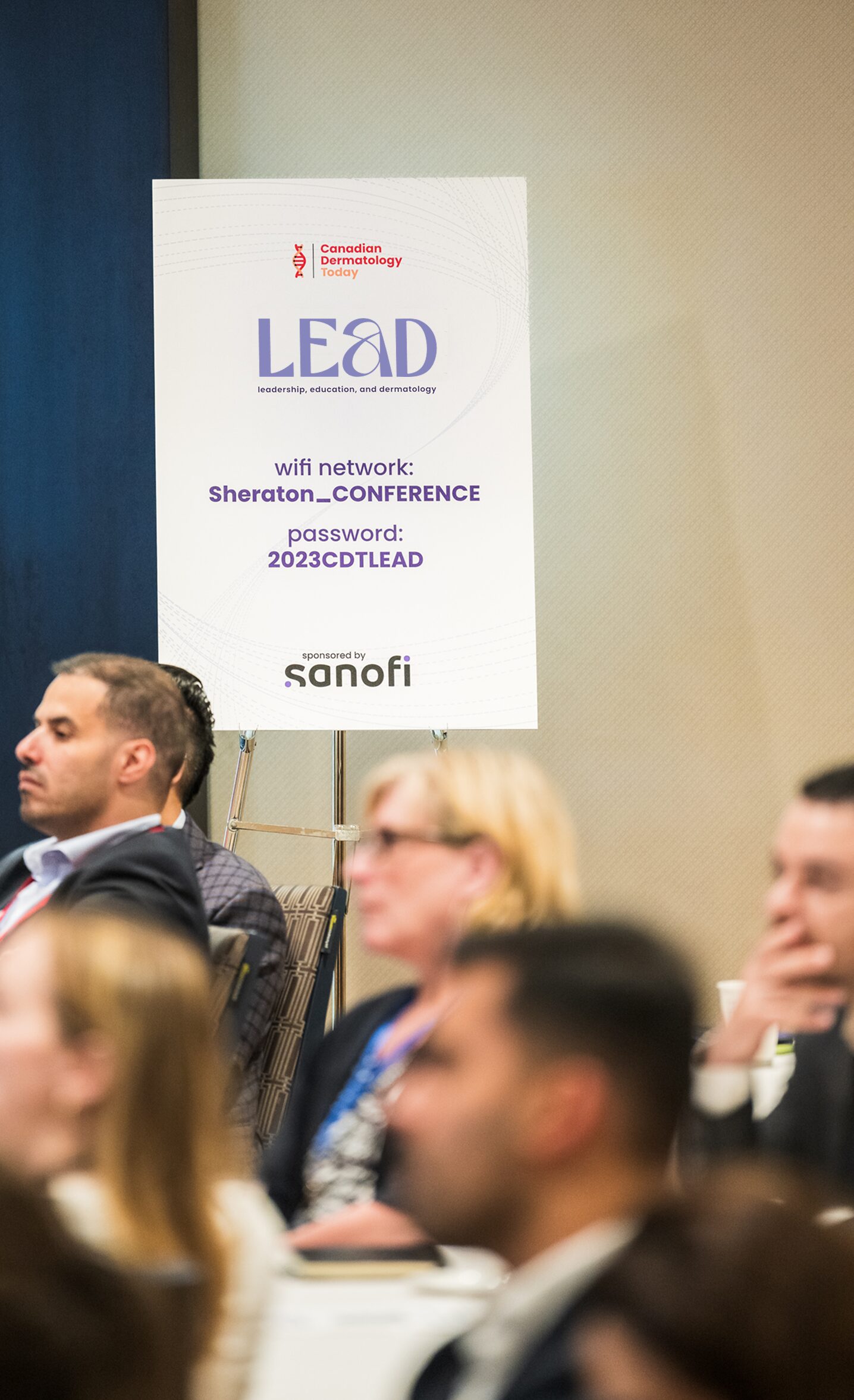
The LEAD (Learning, Education, and Dermatology) Symposium is an educational conference series offering training and participatory learning for early-in-practice dermatologists, with an emphasis on workshops and case-based presentations.
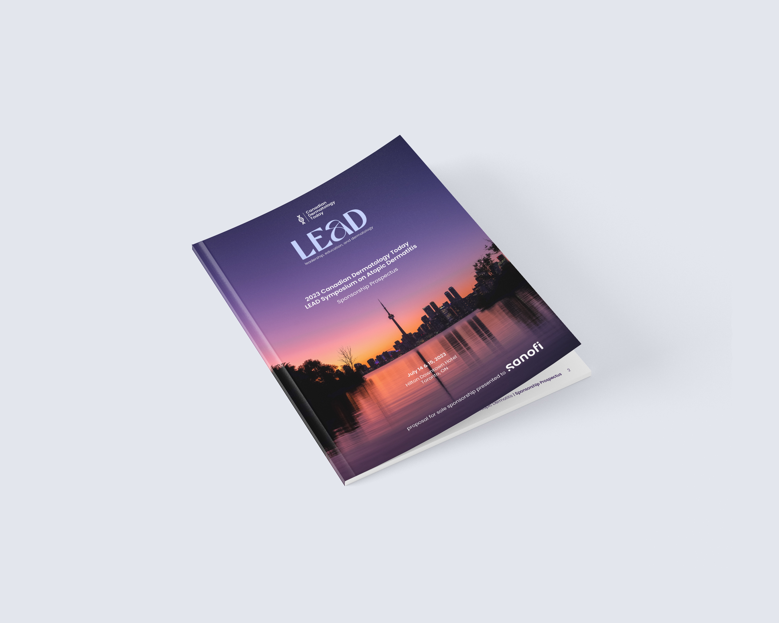
Presented by Canadian Dermatology Today in partnership with Sanofi, the client wanted an original logo and brand identity for the conference series to complement both existing brands while being distinct; in particular, it must not use any of Sanofi’s established branding but should still be recognizable as a Sanofi initiative when identified as such.
Logo Development
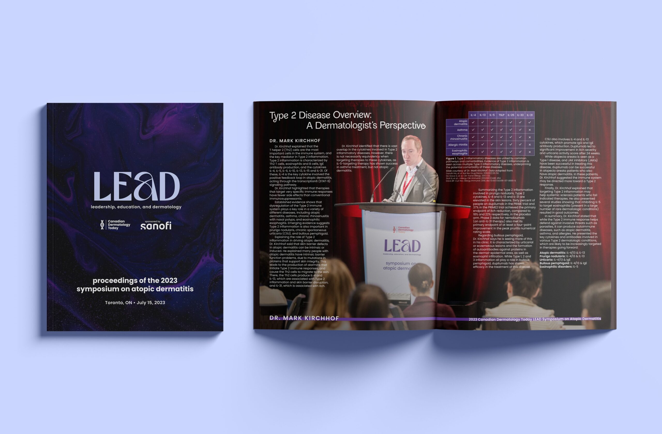
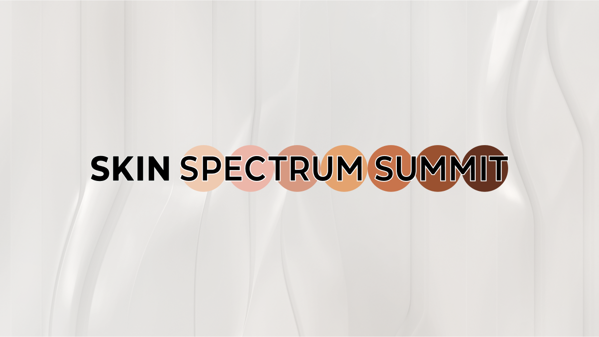
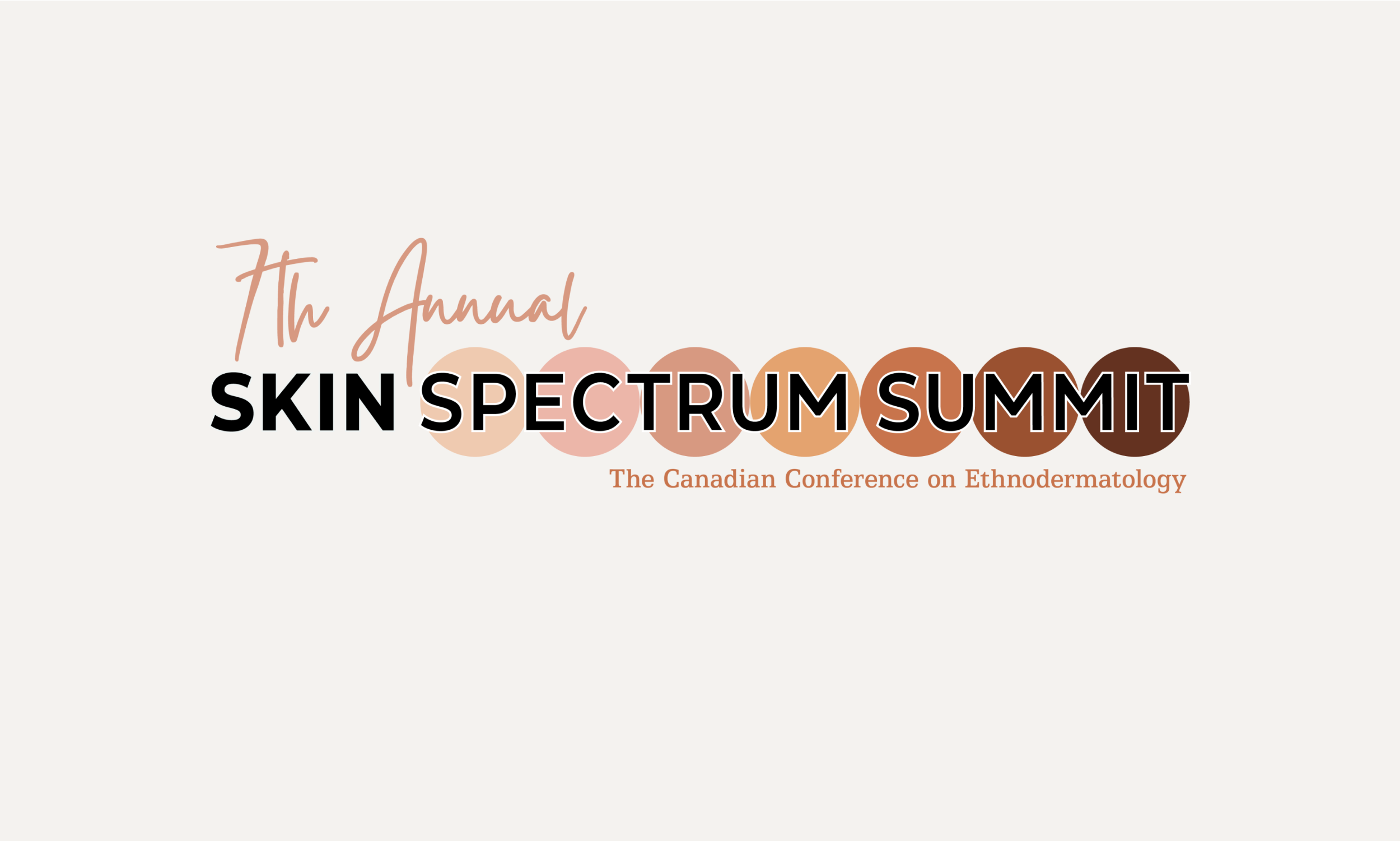
The name of the symposium is a ‘backronym’ of “Leadership, Education, and Dermatology.” The final version of the logo lampshades the unorthodox inclusion of “and” in the initialism by playing with case and form.
While all four letters are uniform in height, the logo contrasts uppercase characters for ‘L‘, ‘E‘, and ‘D‘ with a lowercase ‘a‘—a nod to the uncapitalized “and” in the full name of the symposium.
The shape of the ‘a‘ is further transformed by a smooth, curving stroke through the aperture, giving it a form reminiscent of an ampersand (&).
Brand Colours
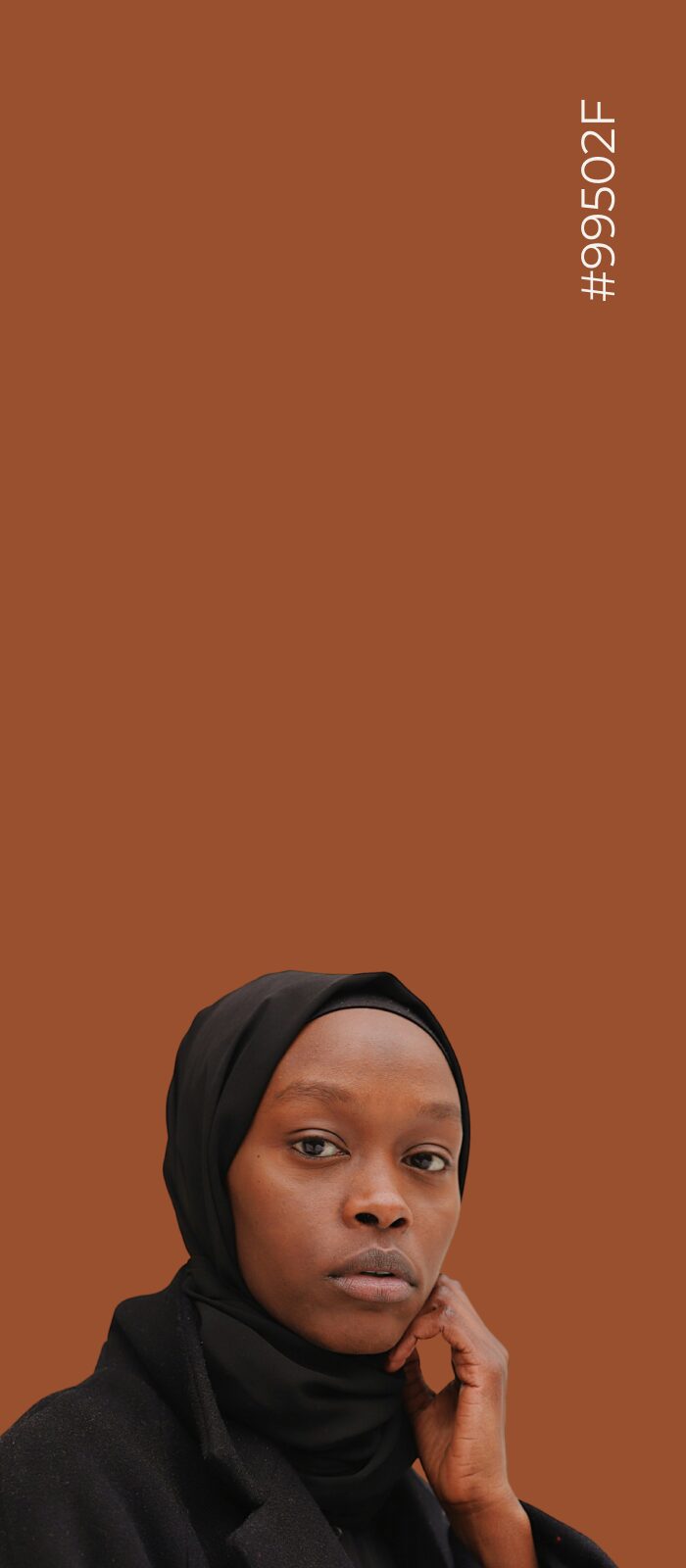
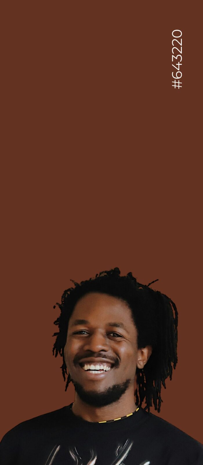
Drawing from the existing colour palettes of the branding for Canadian Dermatology Today (red and orange) and Sanofi (purple), I developed a new set of branded colours specifically for LEAD projects.
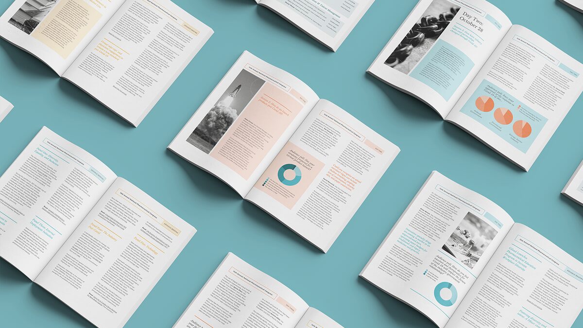
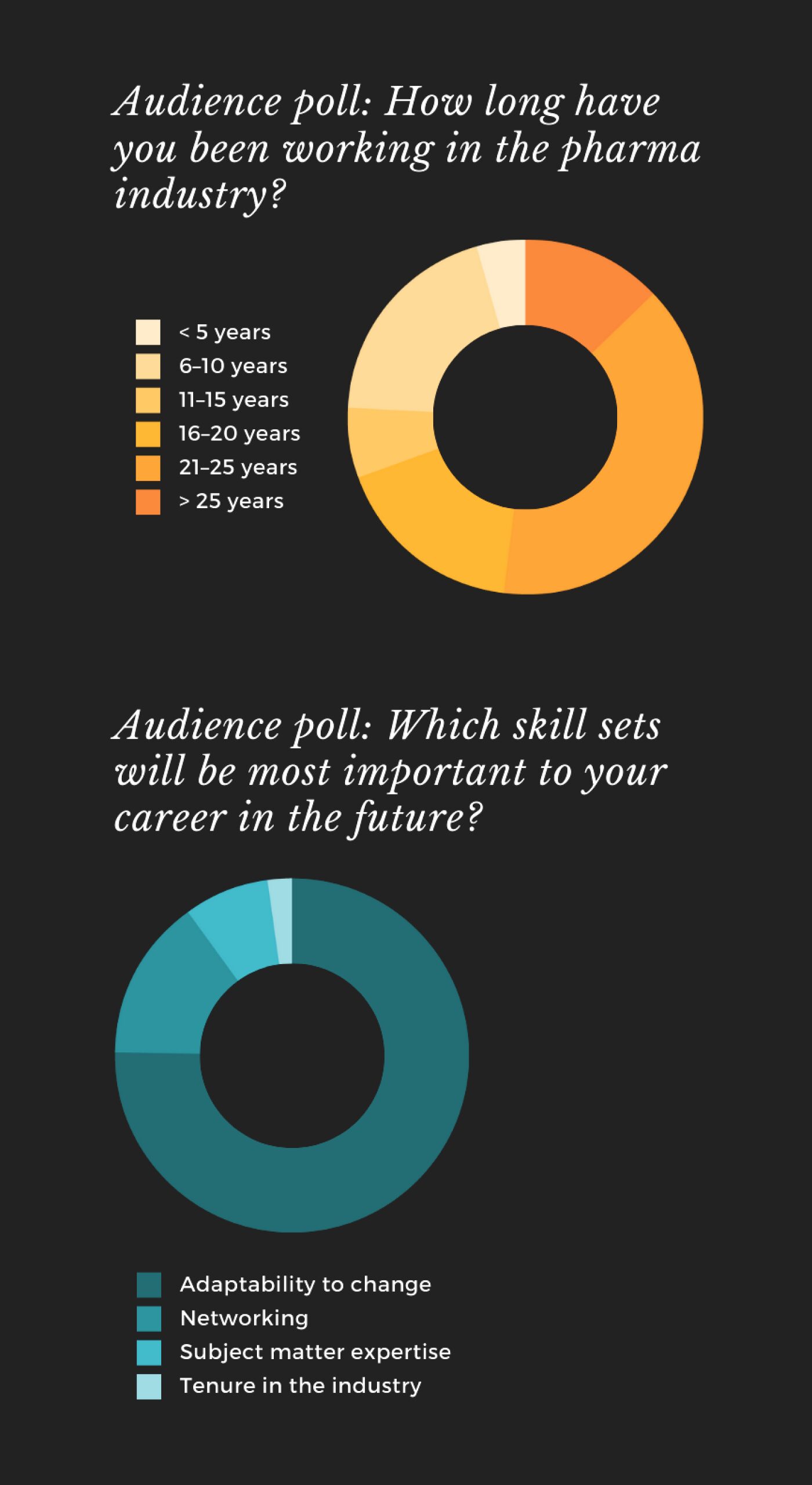
The new brand identity also includes a full suite of bright, high-contrast colours fully integrated into a Microsoft Office theme for easy data visualization for reports and presentations.


Primary Colour
#C5D2FE
Secondary Colours
#C54820
#462F6E
Accent Colours
#E69800
#BFC520
#76DAC8
#8084DD
#BD93D8

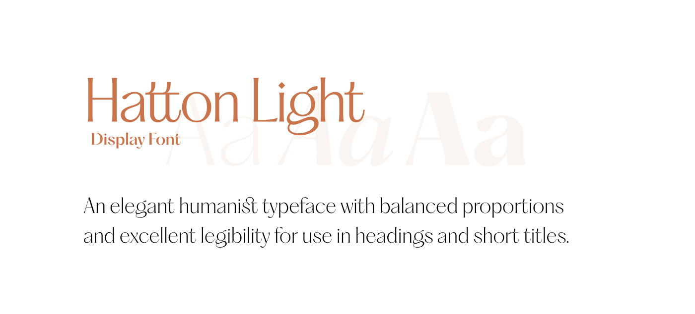
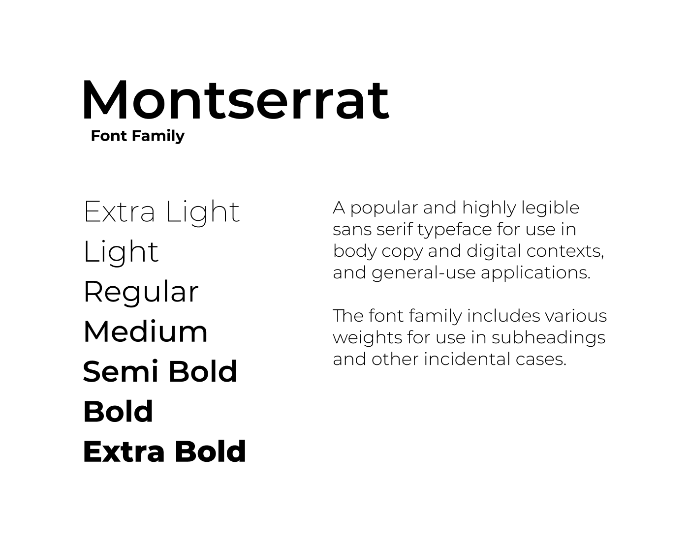
Brand Font

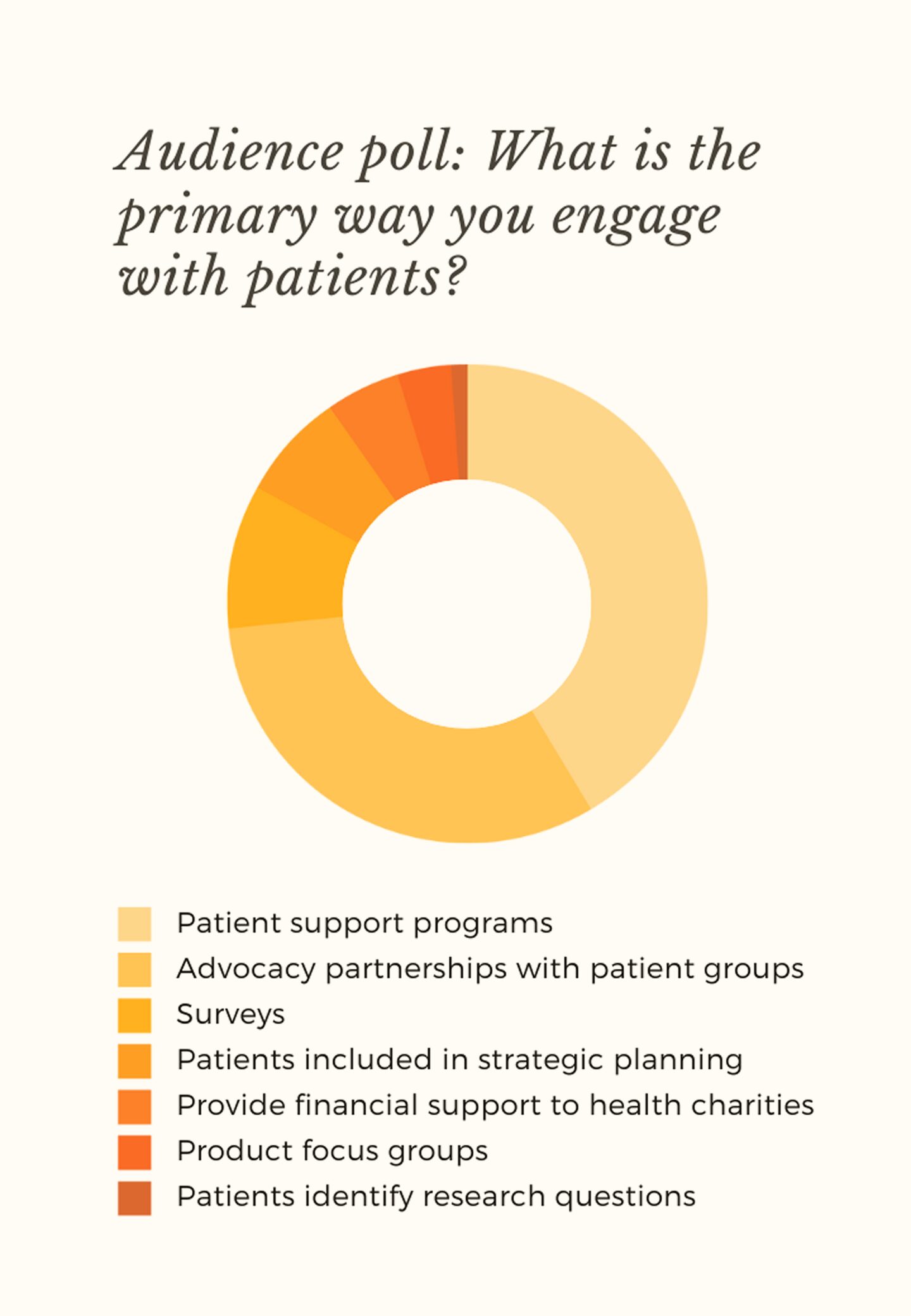
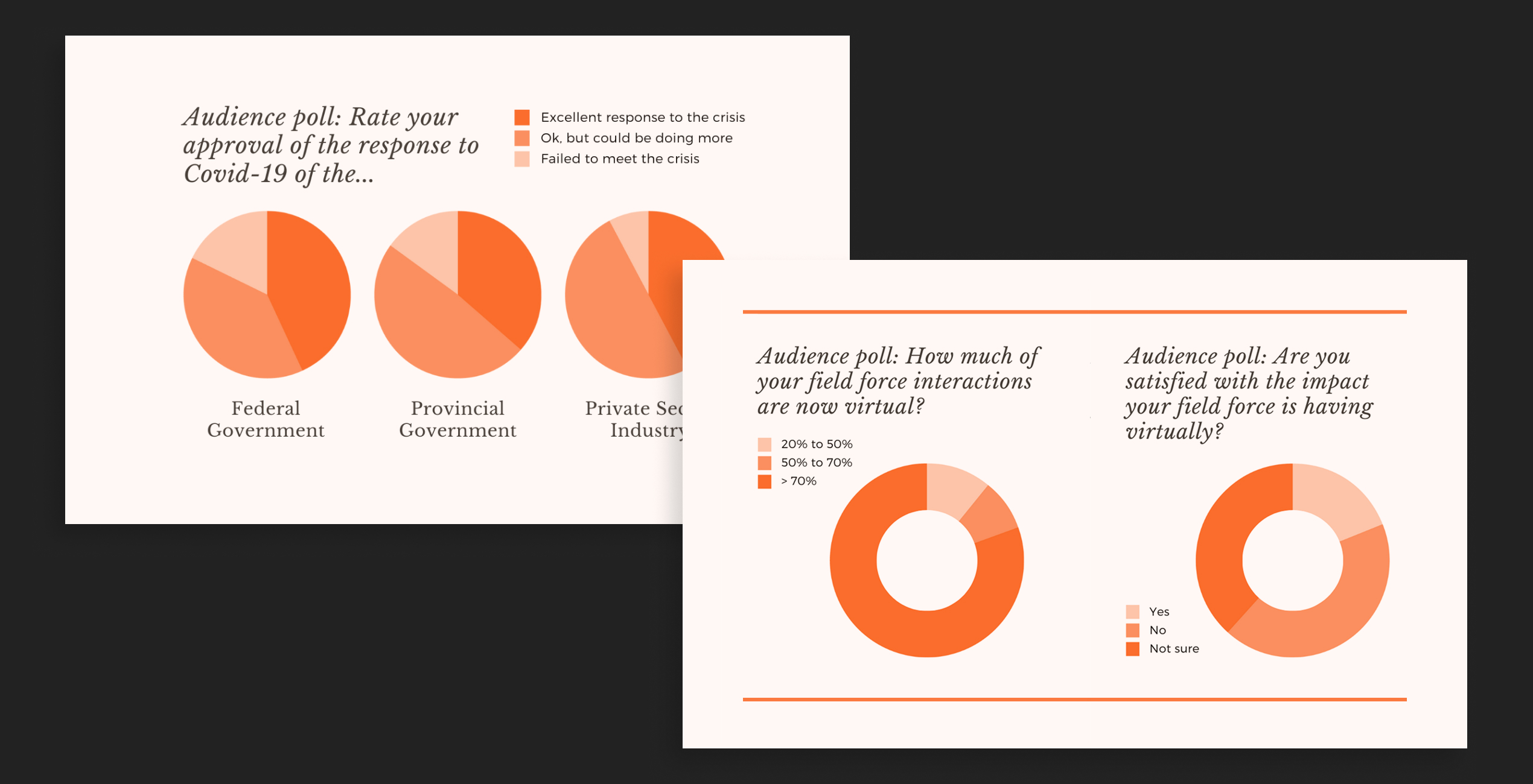
Data Visualization