An annual dermatology conference for healthcare professionals on treating skin of colour.
About the Client
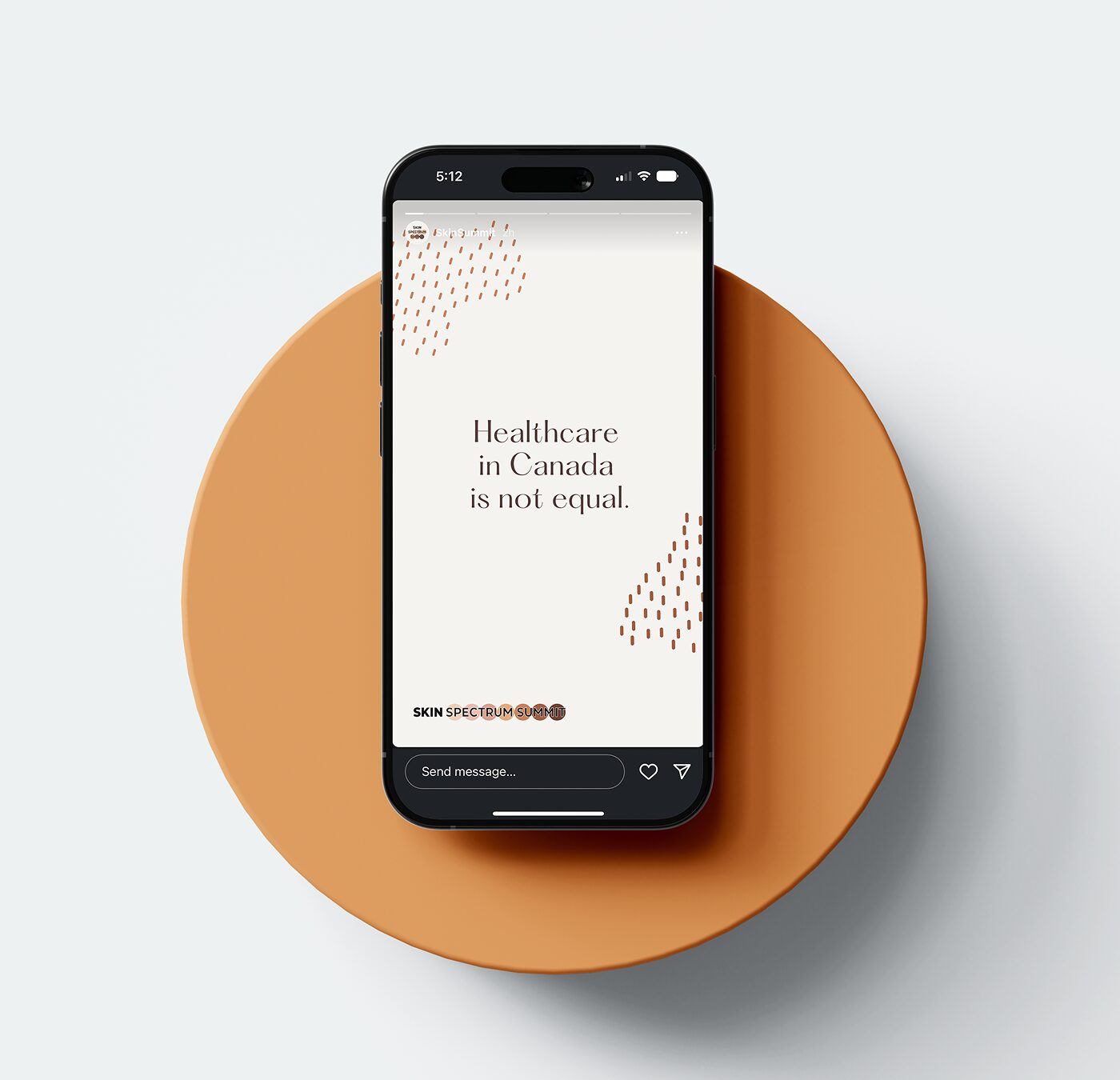
The Skin Spectrum Summit is an annual medical educational event for Canadian dermatologists focused on optimizing treatment for patients with darker skin types.
The brand lacked cohesiveness and its impact was misaligned with its goals. Its former beiges and tans were at odds with the conference’s intended focus on darker skin types.
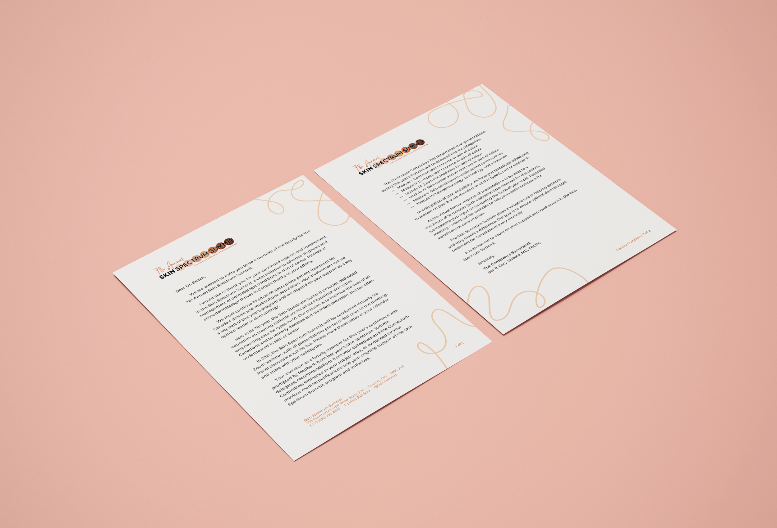
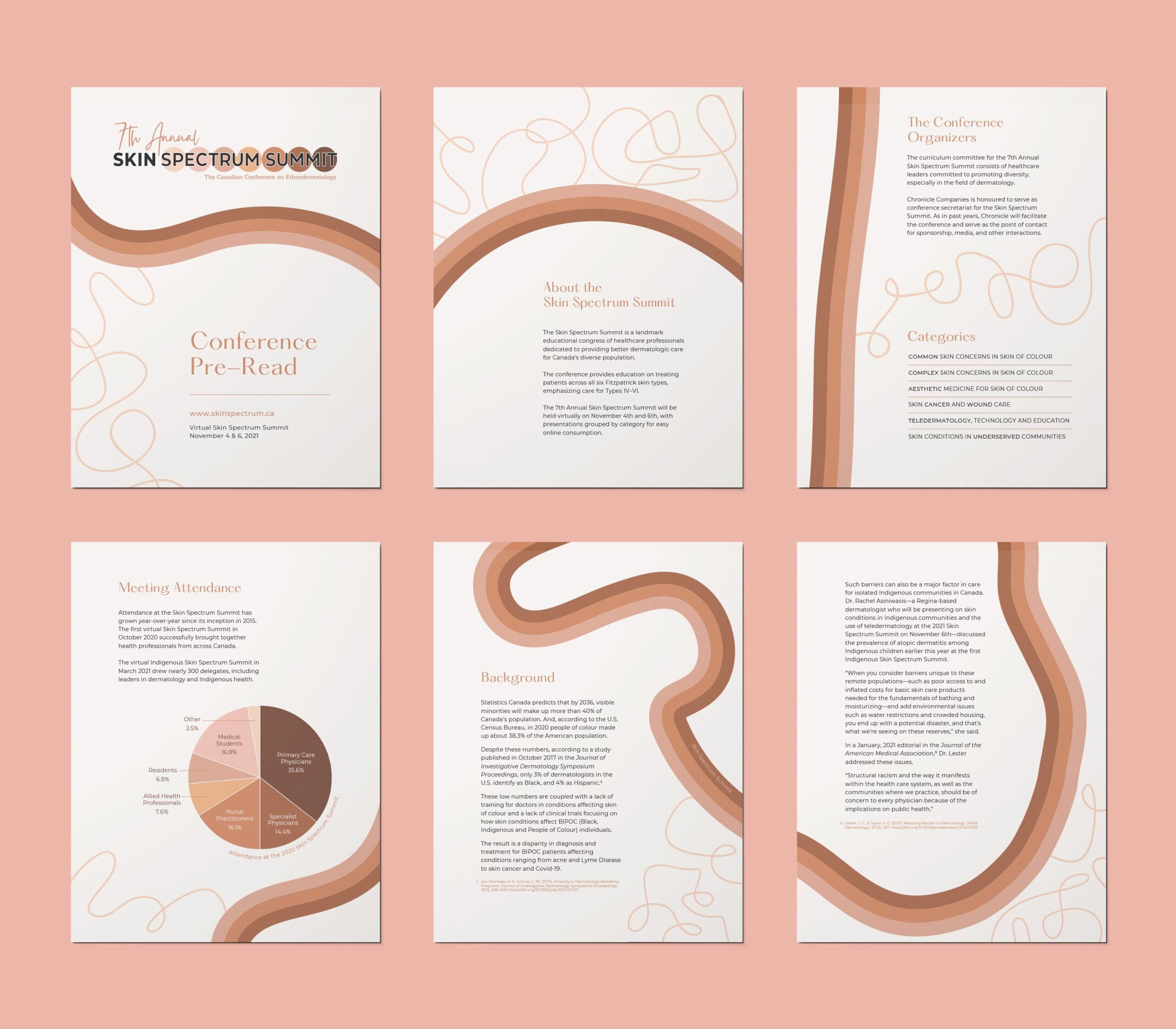
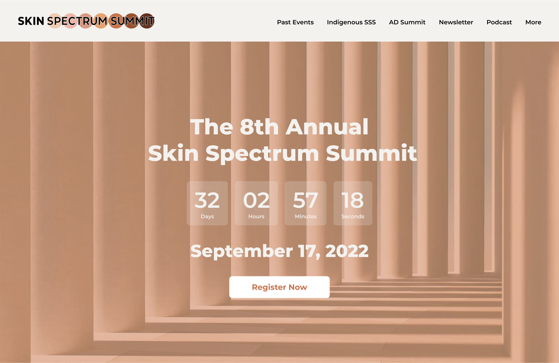
The organizers wanted to keep the established and widely recognized logo substantially similar and build out a unified visual identity that could be applied across a large range of documents and conference materials.
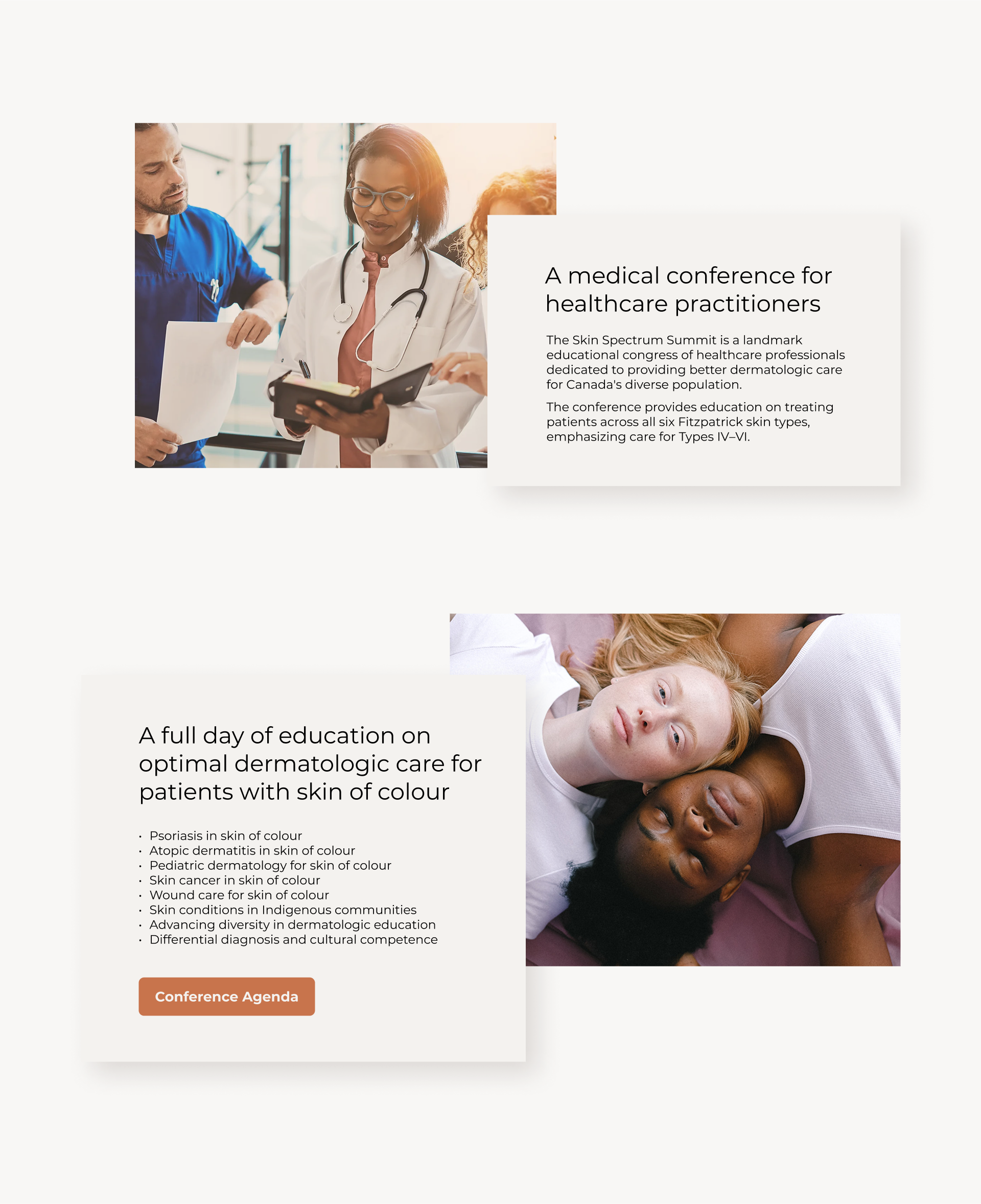
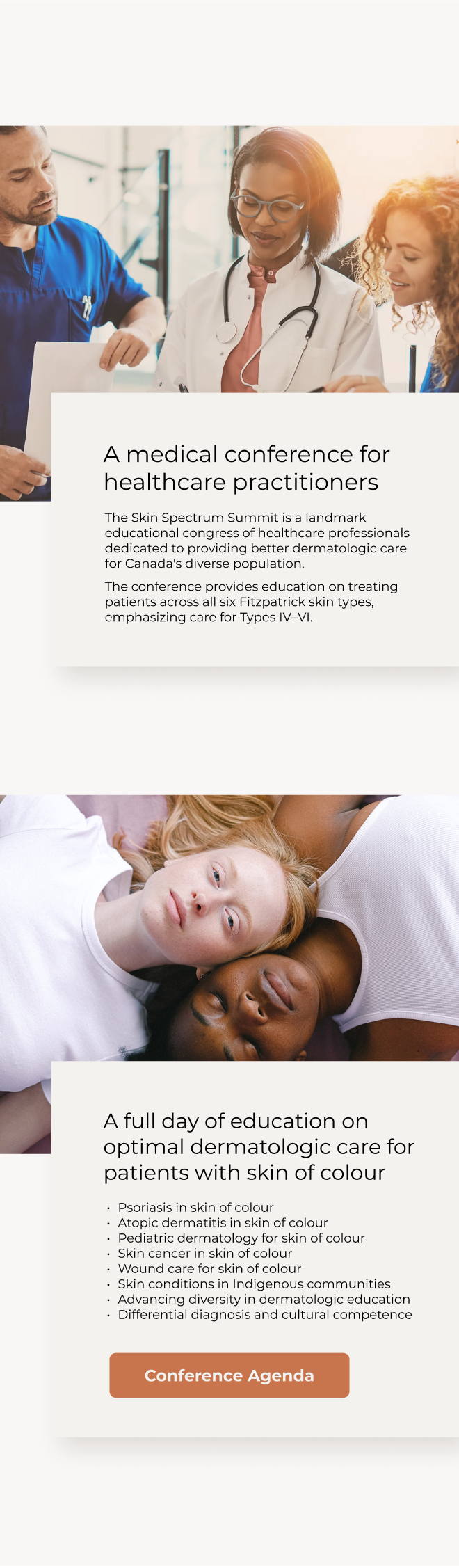
The Skin Spectrum Summit is a well-established educational congress of healthcare professionals dedicated to providing better dermatologic care for Canada’s diverse population.
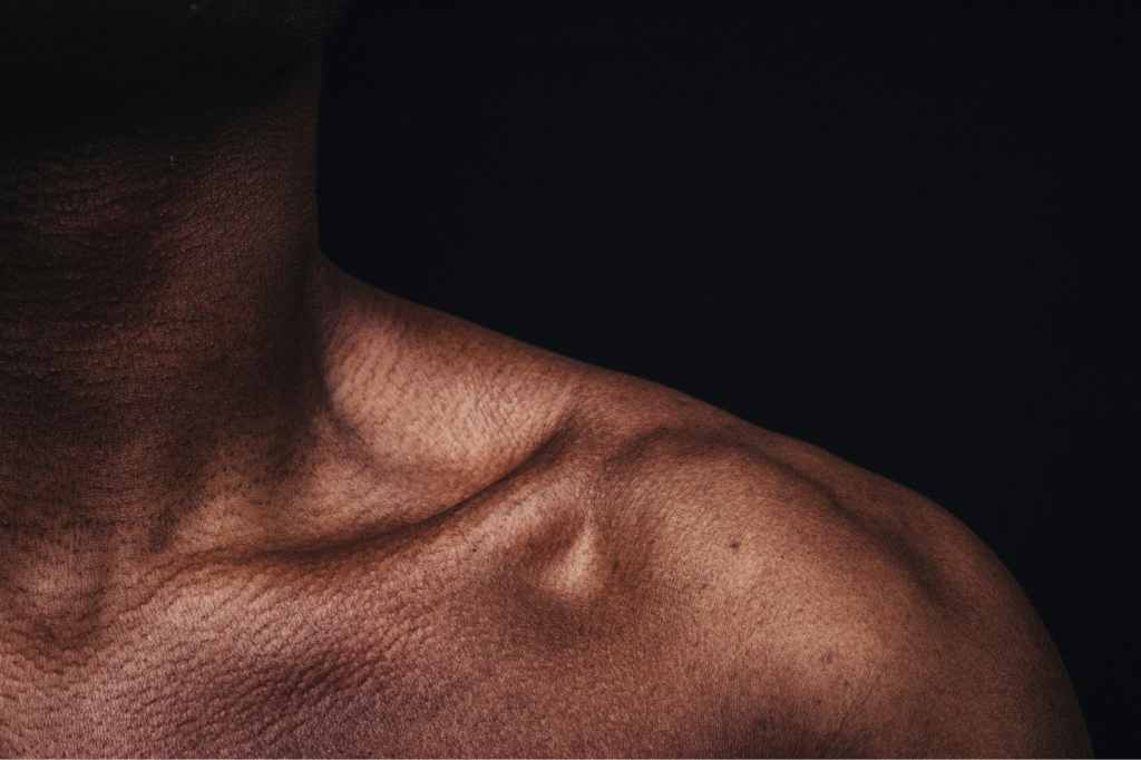
The conference provides continuing education on treating patients across all six Fitzpatrick skin types, emphasizing care for Types IV–VI.
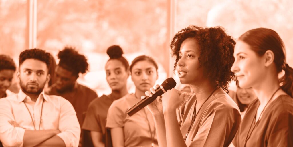
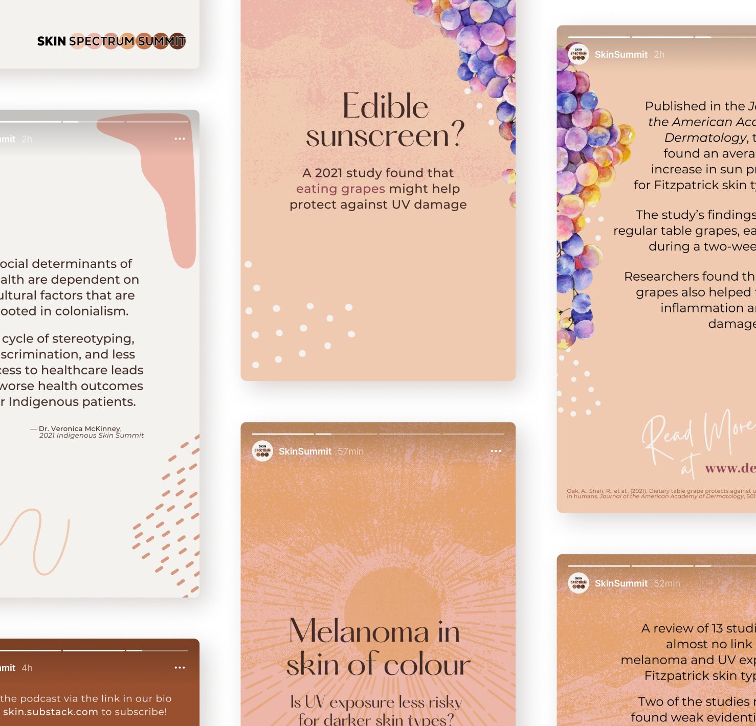
Since its inception, the Skin Spectrum Summit has sought to provide the highest quality dermatologic education in order to eliminate healthcare disparities in Canada.
We believe all patients deserve to thrive, and recognize that optimal treatment differs across skin types.
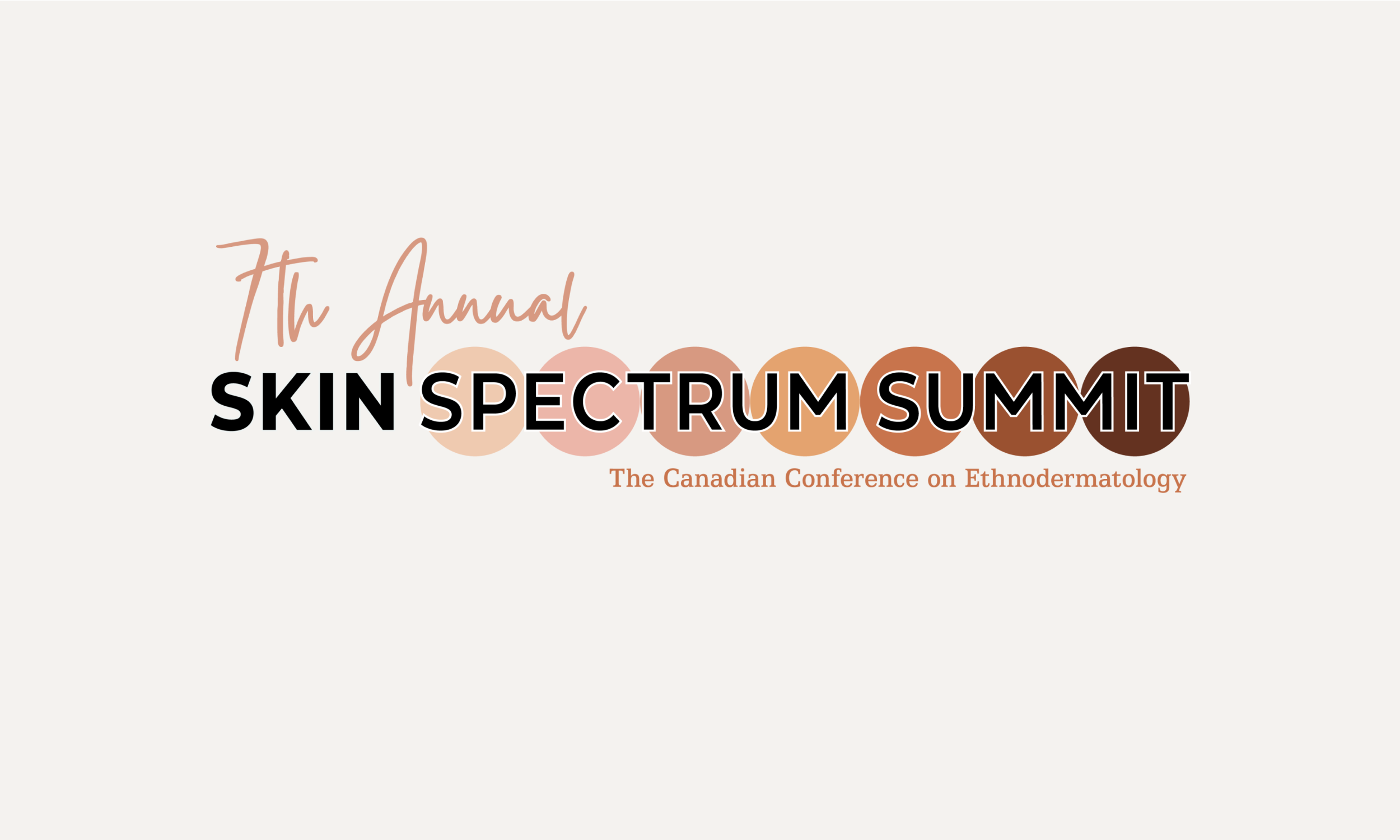
Logo Evolution
The previous logo suffered from a lack of clear use guidelines. It worked against the conference’s own stated objectives by incorporating multiple pale, unrealistic “skin tone” colours.
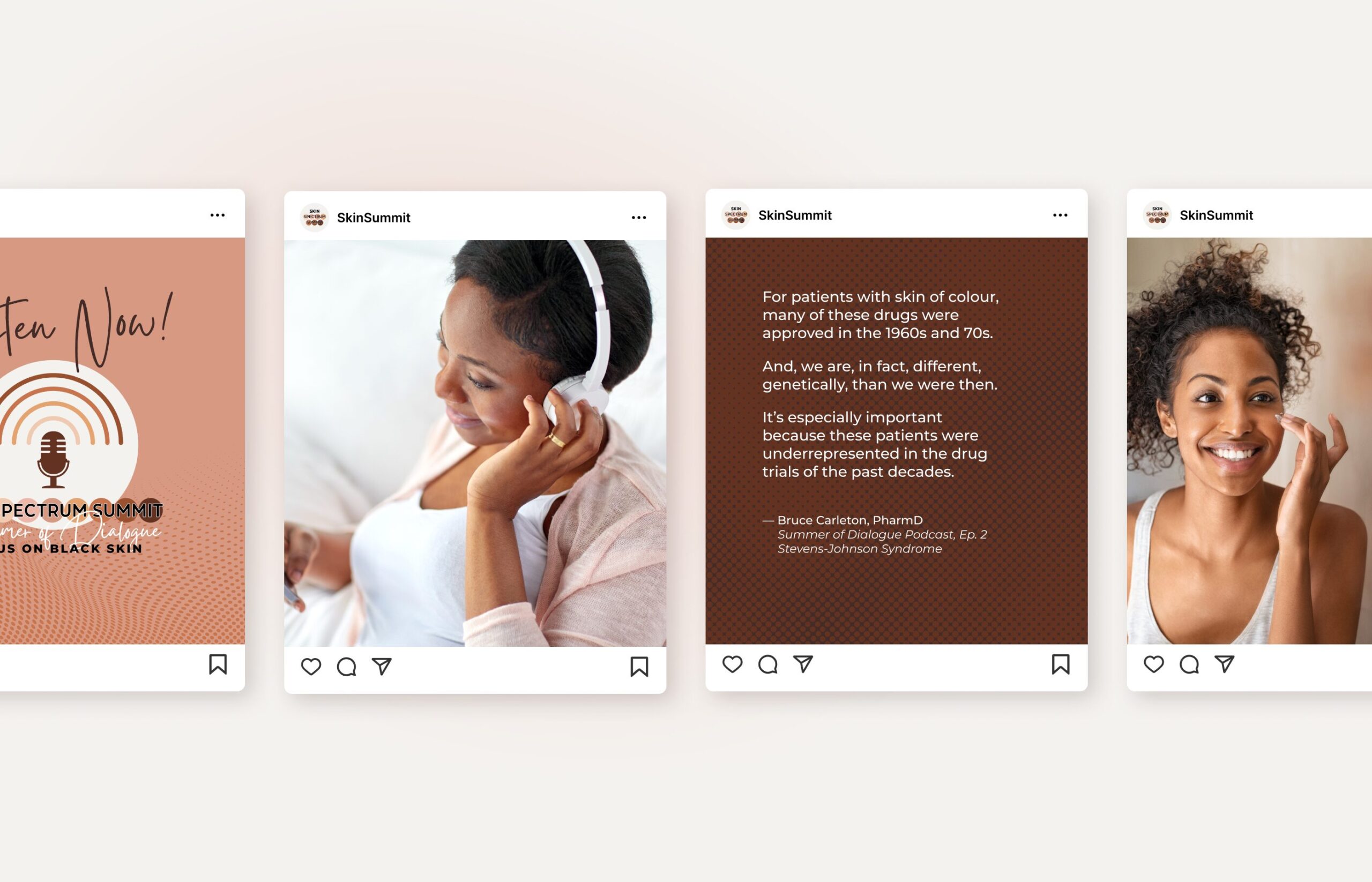
While retaining the logo’s well-established shape, we refreshed the brand by defining a new, vibrant colour palette that spoke to the conference’s true objective of focusing on dark skin tones.
Before
After

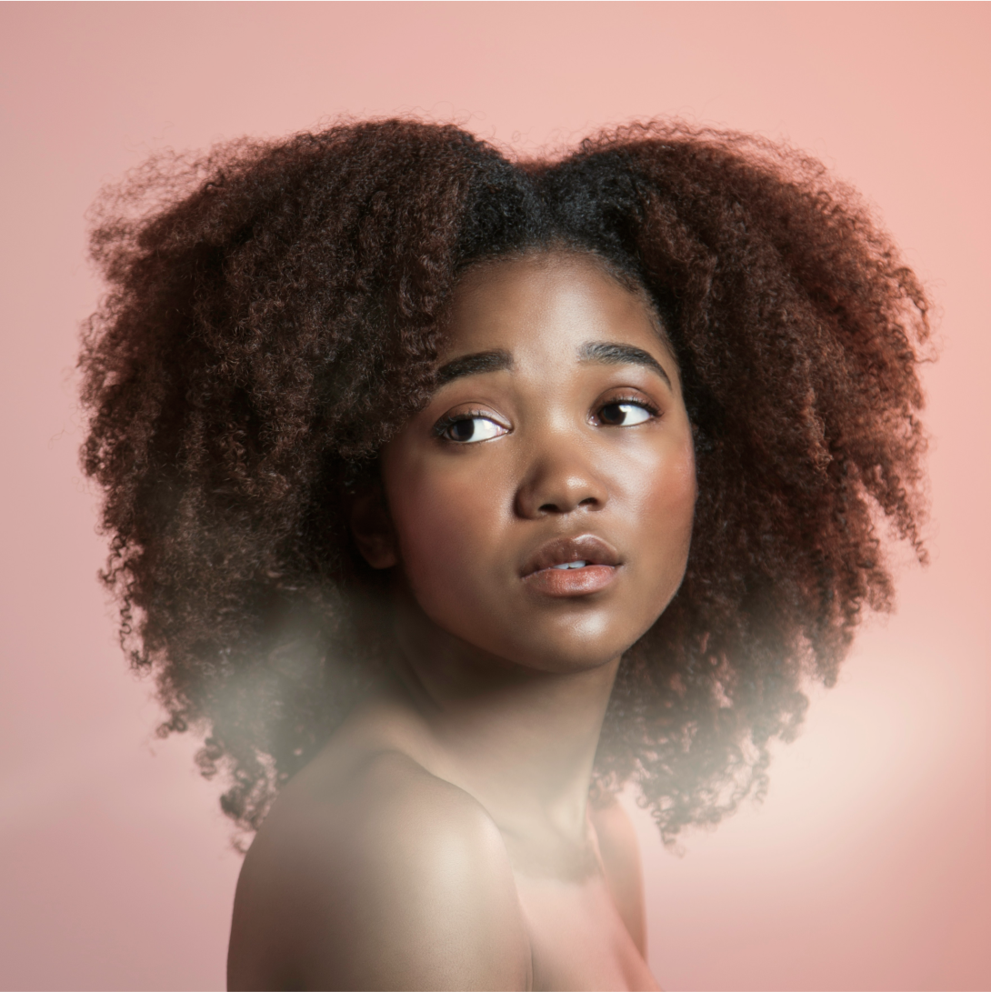
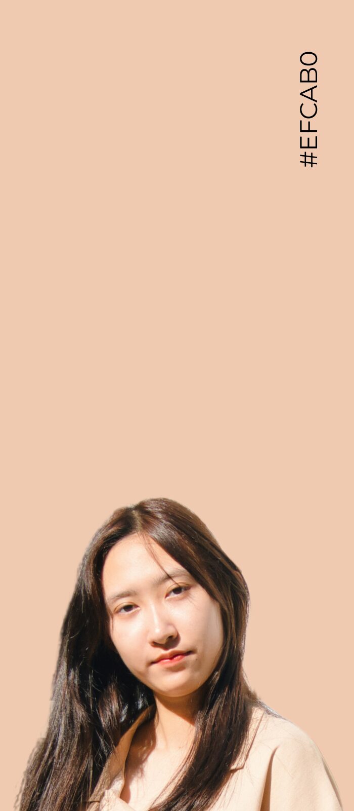
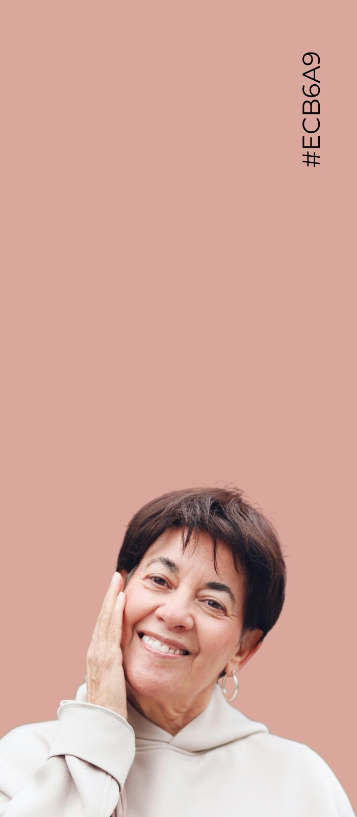
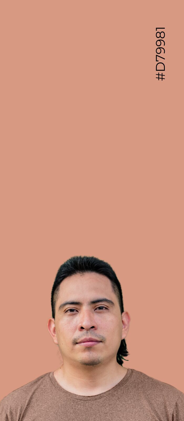
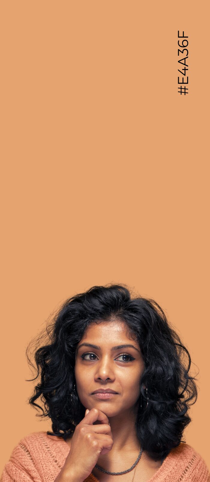
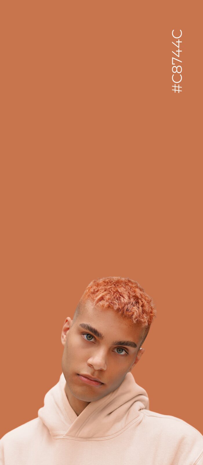
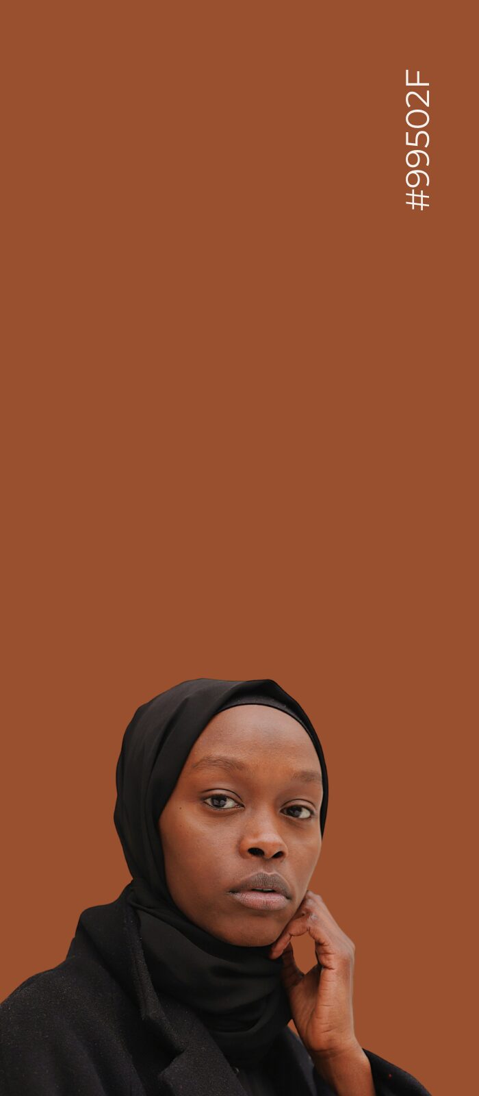
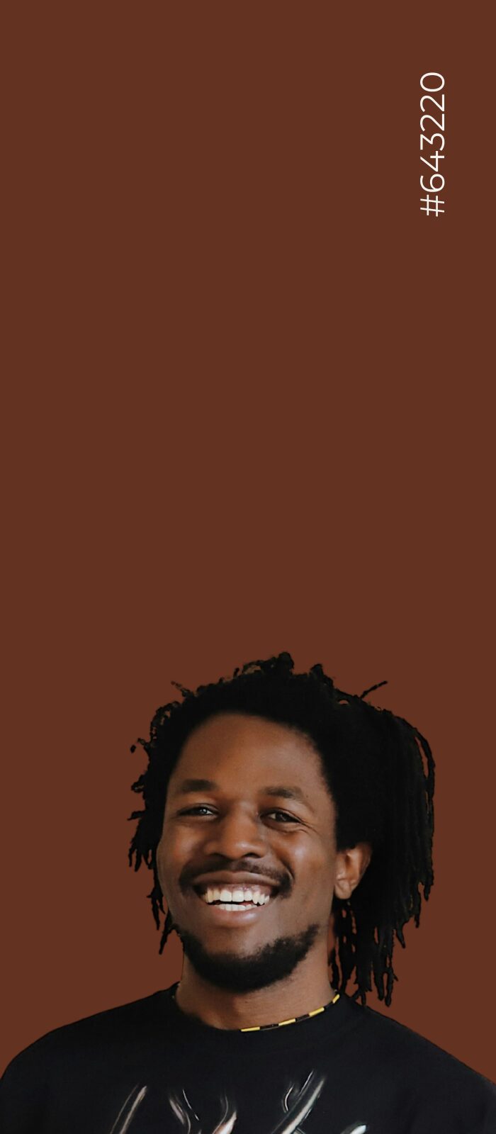
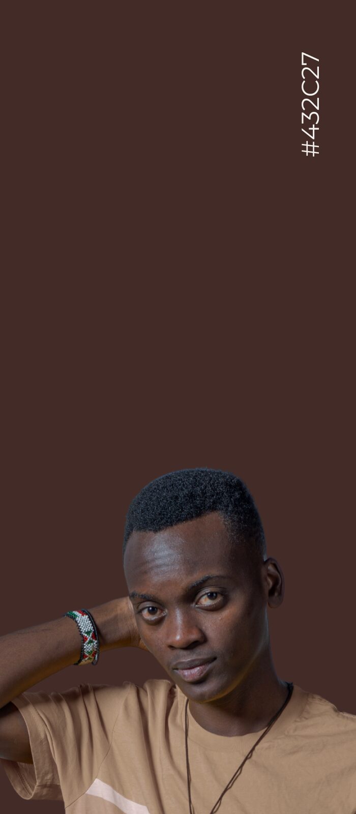
Inspired by the Humanae project by artist Angélica Dass, we redefined the brand colours by sampling pixels from real skin tones.
The new colours include vibrant pinks, oranges, yellows, and browns that reflect the true spectrum of human skin.